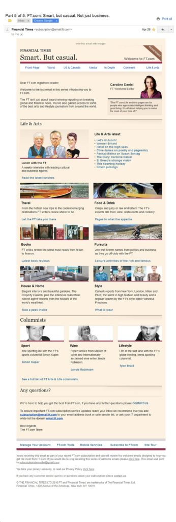
December 6, 2012

Angie’s List Uses Special Offer to Convert Visitors to Paying Subs

In this marketing sample, In order to lure “window” shoppers back, Angie’s List doesn’t just send a welcome email to email opt-ins — it sends a special offer and discounted membership.

Angie’s List Uses Special Offer to Convert Visitors to Paying Subs Read More »

Demand Metric Employs Best Practices to Welcome B2B Registered Users

The best welcome emails contain two things — the nuts and bolts information a user needs to login, and some marketing and benefit copy to entice them to use your site. This welcome email from Demand Metric is a great example of how B2B sites can create simple but elegant welcome emails without the expense or hassle of HTML or fancy graphics.

Demand Metric Employs Best Practices to Welcome B2B Registered Users Read More »

Testing Mom’s Simple Email Gets Users Started Quickly

In this Sample, Testing Mom, a site which gives parents the tools, content and support they need to make sure their child is prepared for all of life’s tests, keeps things simple with its welcome email, but also masters the art of brevity. With this no-nonsense, no graphics email, users not only get a reminder of their login ID and password, but one clear first step to take — a great way to get registered users to act right away!

Testing Mom’s Simple Email Gets Users Started Quickly Read More »

Netflix’s Email to Save Trial Abandons

In this Marketing Sample, we look at a “save attempt’ email from Netflix. Netflix’s homepage is designed to be one big conversion funnel for its free trial (with credit card). But still, some visitors abandon the form. To save those lost subscribers, Netflix quickly issues a save attempt email.

Netflix’s Email to Save Trial Abandons Read More »

StockTwit Uses Simple Design and Graphics to Welcome Registered Users

While text-only emails can be effective enough for welcome emails and onboarding campaigns, some sites may want something a bit more visually appealing–but without spending a lot of dough. StockTwit does just that with this elegant two-color (gray and green) design with simple graphics that’s sure to engage site users.

StockTwit Uses Simple Design and Graphics to Welcome Registered Users Read More »