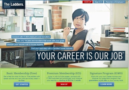
TheLadders.com, a subscription site for high-salary job seekers, used to have a boring text-on-blue-background homepage. This new design, featuring a "people image" and brilliantly-bulleted benefit copy, probably converts better. (We suspect they'll swap out the person in the image routinely, but perhaps keep the template.) Several design elements to note:
Small header. Vertical space is at an extreme premium for homepages because many visitors don't scroll beyond the fold. TheLadders has a sma...
HELLO!
This premium article is exclusively reserved for Subscription Insider PRO members.

Want access to premium member-only content like this article? Plus, conference discounts and other benefits? We deliver the information you need, for improved decision-making, skills, and subscription business profitability. Check out these membership options!


Learn more about Subscription Insider PRO memberships!
Already a Subscription Insider PRO Member?
Please Log-In Here!