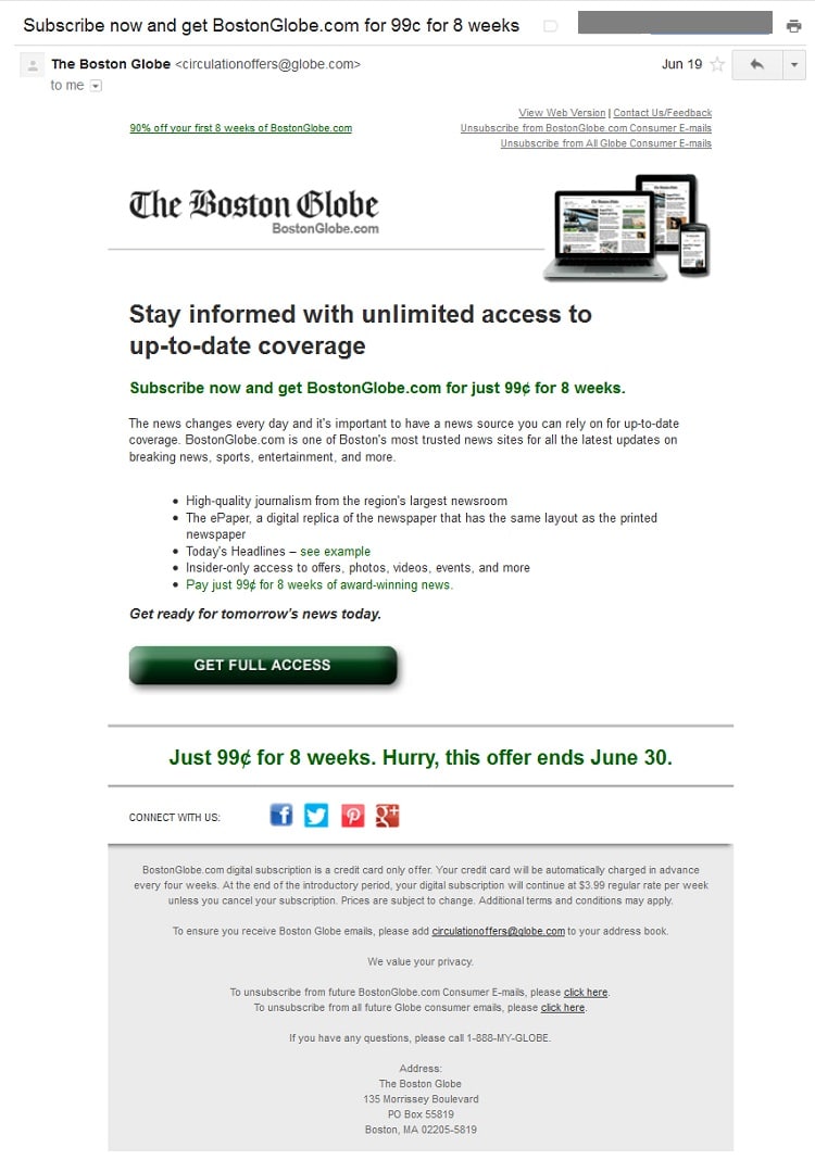
Boston Globe’s Introductory Subscription Offer for 99c for 8 Weeks
Lorem ipsum dolor sit amet, consectetur adipiscing elit. Ut elit tellus, luctus nec ullamcorper mattis, pulvinar dapibus leo.
We like this standard introductory offer from The Boston Globe for the simplicity of its design and copy. Notice that it avoids special characters in the subject line by using a "c" instead of a ¢ sign. The images and button copy make it clear that the offer is for comprehensive digital access. And while we would have preferred a button above the fold, The Globe's testing expert Natalie Bean told the audience at Subscription Site Summit that the button actually performed better below the fold. O...
HELLO!
This premium article is exclusively reserved for Subscription Insider PRO members.
Want access to premium member-only content like this article? Plus, conference discounts and other benefits? We deliver the information you need, for improved decision-making, skills, and subscription business profitability. Check out these membership options!
Learn more about Subscription Insider PRO memberships!
Already a Subscription Insider PRO Member?
Please Log-In Here!
- Filed in Paywall, Sample Library, Subscriber Acquisition, Subscriber Only


