Want more visitors to accept your membership or subscription offer? Check out the lessons learned from our critiques of paywall sites - all 16 lessons are applicable to your site.
Three Member Questions Answered
How much will a customized subscription page cost?
This depends very much on the program your site was created in. If you have a WordPress-based, or other PHP-based site, you can get custom programming fairly cheaply (low hundreds) because thousands of freelance programmers with experi...
HELLO!
This premium article is exclusively reserved for Subscription Insider PRO members.

Want access to premium member-only content like this article? Plus, conference discounts and other benefits? We deliver the information you need, for improved decision-making, skills, and subscription business profitability. Check out these membership options!

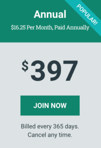
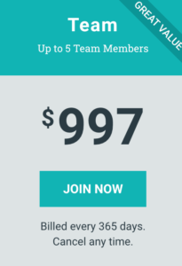
Learn more about Subscription Insider PRO memberships!
Already a Subscription Insider PRO Member?
Please Log-In Here!