LivePlan Offer Page Showcases New Best Practice Conversion Techniques

LivePlan is an online “live” business planning tool that helps entrepreneurs develop a business plan, as well as track a business against that plan

LivePlan (www.liveplan.com) is an online “live” business planning tool built by Palo Alto Software, a provider of small business tools worldwide.  LivePlan helps entrepreneurs develop a business plan as well as track a business against that plan once the initial planning is done.

OFFER PAGE

LivePlan utilizes a design approach friendly to mobile users who cannot click-around – due to their device or due to limited time – and presents a well thought-out offer page that provides lots of detail about their product, once you scroll beyond the initial top part of the page. Everything is focused on conversion with benefits clearly laid out for a busy entrepreneur.

1.       Floating Header:  The LivePlan header stays at the top of the offer page, no matter how far one scrolls down (and there is a LOT of information below this top screen!).  This is a nice design technique if your CMS supports it, to support conversion.

2.       Clear Benefit-Oriented Headline:  We like the visual nature of this page and the clean benefit-oriented headline.  Insiders take note! 

3.       Subscription Options: There are a lot of things LivePlan is doing well here in presenting its subscription offer – it’s simple, packed with information.  Elements worth emulating are the gentle visual guidance to the annual plan, very clear information, a call to action button that is a benefit (Start Planning Today!) and the reiteration of another benefit right under the “Start Planning Today” button (Sign up in under a minute!). 

4.       Guarantee:  100% Money back guarantee is clear and a proven winner to support conversion by establishing trust between a potential customer and a new brand for that customer.

5.       Deal with Potential Objections Upfront: The last line here tackles right upfront the other key questions a potential customer may have.


But wait, there is more!  

The LivePlan page above looks complete, doesn’t it? Well it IS.  But what LivePlan also did was provide detailed information that a potential customer can look at by just scrolling down. This is an effective tactic for engaging and converting customer on mobile.

1.       Top  “Core” Subscription Offer

2.       The “What Makes Us Different” section, walks through prospective LivePlan customer key product features and differentiators.

3.       “Key Features” and “Key Fans” section plus “We are Here to Help” , walks through details product features and offers customer testimonials. We love the pictures of the customer services team – that is how to personalize a company!

4.       Frequently Asked Questions (FAQ). If they have not answered a question yet – this section certainly would.

5. Links to company info footer to answer important questions about who is behind the service or find other information.


CHAT:

The LivePlan team focus on customer service does not leave anything to chance, if you have not engaged after 60 seconds, their live support window will turn on and ask if you have any questions. 


CREDIT CARD PAGE: 

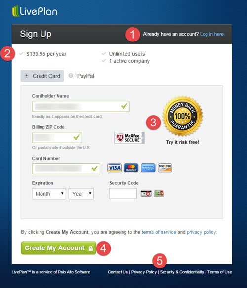
The LivePlan Credit Card page continues their well thought-out customer communications. 

1.       Log in area for existing members at the top of the page:   Nice touch to make sure members don’t have to find the log in link to get to work.

2.       Benefits area at the top of the Credit Card Form: Simple design doesn’t take a lot of space, yet this important area reiterates the choices a potential customer has made including pricing and the key parts of the version they ordered.

3.       Assurance Logos:  Putting “assurance” logos next to Credit Card information fields is a long held best practice to increase conversion.  We like the simple design of the Money Back Guarantee Seal and the McAfee Secure seal, which both send a reassuring message to potential customers.

4.       Call to Action Button:  Notice the wording is not “Order Now”, its “Create My Account”,  a benefit that reinforces previous communications. Also, note the pad lock on the call to action button, reinforcing that an order is secure.

5.       Company Information:  It’s counter intuitive to add links to a form that takes people away from the order, but we commend LivePlan for thinking this through.  These links represent four use-cases that someone on an order form may need: 1) Contacting a human, 2) Knowing more about the Company, 3) Understanding the company’s privacy policy and 4) Understanding terms & conditions.  They all open up in a new window – so the original order form is still live and open waiting to be completed.


Insider Take:

We love LivePlan’s 100% focus on the needs of their potential customer, providing easy-to-understand benefit-oriented information combined with great design.  For any subscription site, we recommend testing how these tactics work with your potential customers to increase your own conversions.


Up Next

Register Now For Email Subscription News Updates!

Search this site

You May Be Interested in:

Log In

Join Subscription Insider!

Get unlimited access to info, strategy, how-to content, trends, training webinars, and 10 years of archives on growing a profitable subscription business. We cover the unique aspects of running a subscription business including compliance, payments, marketing, retention, market strategy and even choosing the right tech.

Already a Subscription Insider member? 

Access these premium-exclusive features

Monthly
(Normally $57)

Perfect To Try A Membership!
$ 35
  •  

Annually
(Normally $395)

$16.25 Per Month, Paid Annually
$ 195
  •  
POPULAR

Team
(10 Members)

Normally Five Members
$ 997
  •  

Interested in a team license? For up to 5 team members, order here.
Need more seats? Please contact us here.