Washington Post Debuts Paywall With Best and Worst Practices
Lorem ipsum dolor sit amet, consectetur adipiscing elit. Ut elit tellus, luctus nec ullamcorper mattis, pulvinar dapibus leo.
The Washington Post debuted its paywall and digital subscription plans last week, with a mix of best and worst practices.The Post’s website served up a banner pencil ad on the homepage advertising the new digital subscriptions, wisely not calling it a paywall or meter (see below).

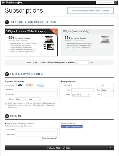
Clicking on the ad got a visitor to the conversion page. Here, The Post had a mixed design. It employed certain best practices, such as highlighting a subscription plan and getting rid of all distractions from conversion, like navigation bars. But it also used a two-column form, which will likely lead to more instances of incorrect data entry. Plus, the actual conversion button looks like a divider and has boring, un-compelling copy (i.e., “Place Your Order”).

But The Post’s biggest problem may be the unclear placement of its paywall. It’s unclear how many articles a visitor can read for free before hitting a paywall, and by offering free access to various groups (students, teachers, government employees, home subscribers), it’s sometimes unclear if one has to pay.
- Filed in News, Subscriber Acquisition


