Capital New York Re-Launches with Complimentary ‘Pro’ Subscriptions Until February
Lorem ipsum dolor sit amet, consectetur adipiscing elit. Ut elit tellus, luctus nec ullamcorper mattis, pulvinar dapibus leo.
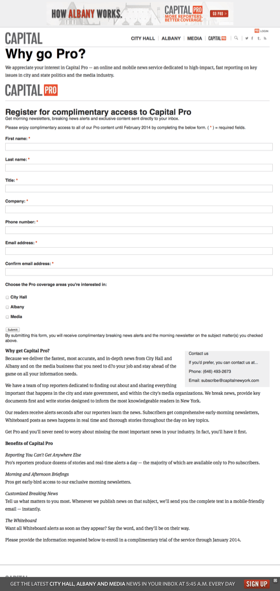
By Minal BopaiahCapital New York, newly acquired by Politico, re-launched today as Capital, with a cleaner design and a “Pro” subscription offering.However, hesitant to scare of the site’s free users, Capital has not yet listed prices to its Pro subscription; instead, Capital is offering complimentary access until February to anyone who signs up.This is a brilliant strategy for sites looking to introduce paid subscriptions to an audience used to free content. The long lead time allows prospects to get used to receiving your content (in Capital’s case, that’s every morning, making it a staple for the New York political junkie’s diet).Politico previously mentioned that it plans to introduce high-end subscriptions, somewhere between $99 and $1,000 a year (Politico Pro goes for about $5,000 a year). That’s clearly too steep a price jump for an audience accustomed to free news, and Capital/Politico is smart to let its audience get a good long fix before asking for money.However, the site’s sign-up page leaves something to be desired.

While Capital was right to use a one-column form for customer information, it would have been wiser to shorten the width of those form fields and then include some of benefit copy above the fold in a second column. They should also get rid of the navigation bar up top — it’s just another distraction for visitors pondering signing up. And lastly, a gray “Submit” button?! Shame, Capital, shame!! Almost any other button would be better!Also, once a visitor signs up, there’s no confirmation page — the sign-up page just refreshes! That’s a big No-No, as it will lead to consumer frustration. Also, it’s a wasted opportunity. Your email sign up confirmation page gets 100% of eyeballs — it’s prime real estate to gain word-of-mouth marketing by asking recent converts to spread the word to their email, Facebook, LinkedIn friends, or for you to start your on-boarding campaign with some warm and fuzzy videos.Capital may also want to check out our advanced tips for optimizing online forms.
- Filed in Industry Announcements, News, Subscriber Acquisition


