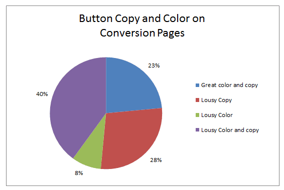
Did you know that 76% of subscription sites are leaving money on the table on their conversion pages? That’s because, according to data from the 2013 Online Subscription Benchmark Report, the vast majority of paid content sites have poor call-to-action buttons.

A good call-to-action button has three main defining features:
- Compelling copy that conveys an immediate benefit to subscribers.
- Contrasting color (i.e., not your brand colors. The button color should be eye-catching, but of the same value and saturation).
- Graphical elements that make it look like a button.
A/B tests have shown that clear, eye-catching buttons can increase click-throughs and other conversion metrics (one test led to a 22.9% lift in email sign-ups). So we were surprised that most sites were not using such a simple and easy-to-integrate design element on their conversion pages.In order to aid subscription sites is resolving this very fixable problem, I held a Webinar this past Tuesday highlighting 30 Great Call-to-Action Buttons for Subscription Sites. You can view it on-demand or download the 30 examples (taken from a variety of sites, including metered news sites, B2B publications, financial newsletters, and dating sites) by joining Subscription Site Insider today.