April 18, 2013

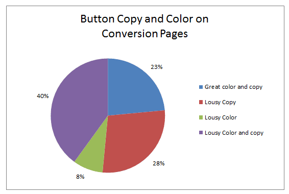
76% of Subscription Sites Have Bad Call-to-Action Buttons

Did you know that 76% of subscription sites are leaving money on the table on their conversion pages? That’s because, according to data from the 2013 Online Subscription Benchmark Report, the vast majority of paid content sites have poor call-to-action buttons. A good call-to-action button has three main defining features: Compelling copy that conveys an immediate benefit to subscribers. Contrasting color (i.e., not your brand colors. The button color should be eye-catching, but of the same value and…

76% of Subscription Sites Have Bad Call-to-Action Buttons Read More »

30 Great Call-to-Action Buttons

Need some color and copy inspiration to boost your online subscription sales? Subscription Site Insider Editor Minal Bopaiah will take you on a tour of the 30 best buttons she’s seen — some of which were featured in Insider’s 2013 Benchmark Report, and some entirely new! You’ll get creative inspiration for getting email opt-ins, converting trial-takers, buttons for house ads, selling online subscriptions, selling event tickets, and upgrading existing subscribers!

30 Great Call-to-Action Buttons Read More »