By Minal Bopaiah
Usually, we try to highlight proven marketing tactics from successful subscription sites, but every once in a while, a little cross-pollination of marketing ideas is in order.
That’s why I’m taking the time today to highlight three lightbox overlay design samples that subscription sites can adapt and use on their own sites to increase email opt-in rates. (Overall, lightbox overlays are known to increase email opt-ins anywhere from 25% to 50%. So if you’re not using overlays already, you should!)
The first is from www.1stwebdesigner.com, a eLearning site with a free blog. As you can see, the design in simple but effective and it only asks for an email to complete the form. But what I really love about this overlay is that it’s cued to appear after a site visitor scrolls down to the bottom of a blog post! That’s brilliant because people who read your entire post are much better prospects than site visitors who spend 3 to 30 seconds at the top of a page.

The second overlay screenshot is from Joss & Main. I love the simple design, which allows a subtle violet color to be an eye-catching button. The only problem with this overlay is that there’s no X to close it. That’s because Joss & Main requires an email address before a site visitor can peruse its catalog. We don’t recommend that for subscription content sites, unless you’re a hard paywall site (but in that case, your overlay should be the start of your subscription conversion funnel).

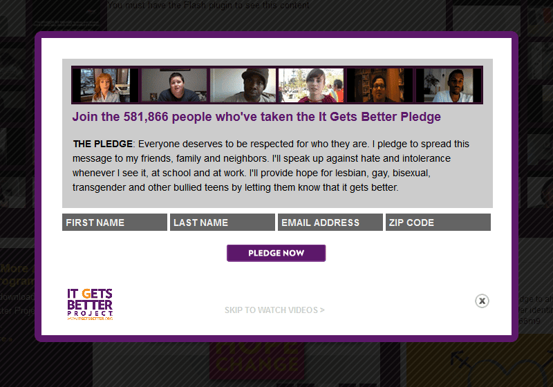
Lastly, we just love this overlay from ItGetsBetter.org, the nonprofit advocacy site. First, the site really darkens the background. Research has shown that the darker the background, the higher the conversion rate (usually). Also, we love that the site makes an emotionally compelling case and then asks for four data points before asking visitors to “Pledge Now.” This is a great example of how membership and nonprofit sites can create highly effective overlays to increase email opt-ins without getting too sales-y.

For more examples, check out our Marketing Samples Round-Up of 10 Awesome Lightbox Overlays on Subscription Site Insider.