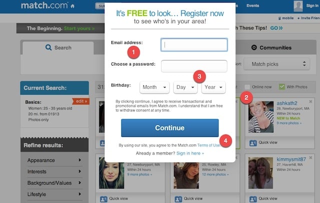
With an estimated 35 million monthly visitors, the highest of all dating sites, Match.com certainly appeals to the vast online dating market. In our view, there are a few key things at the beginning of their registration process they are doing well.
WELCOME PAGE
1. The process of converting visitors into paying subscribers on Match.com is a good example of paywall design. It’s clean and to the point, asking basic questions about the user in order to easily obtain the proper information needed to begin profile construction.
2. To just get started, visitors are asked simple questions about their own gender, which gender and age range they are seeking, and where they are located.
3. In the upper right hand there’s a subtle cross-sell to chemistry.com, another property under the same umbrella.
4. The choice of a button that says “View Photos” instead of “Register” keeps the visitor interested in moving on through the process.

REGISTRATION PAGE
1. The next page in line asks for just a little more information to completely register a profile.
2. The background of the page is populated with photos of potential matches, tempting the user to continue through the registration process.
3. Here they ask for an email address and a password, along with a field to establish a date of birth for age reference.
4. By clicking on the “continue” button, users implicitly agree to the terms of service.

From here on out, the site directs users to continue creating their profile, asking only a few questions on each page to help them complete their profile.
Insider Take:
For starters, each page in the process is simple and easy to complete. Taken together, the information that the site collects is quite a lot. But Match.com splits up the information collection phase into a series of pages that ask for a piece of information at a time, lessening the burden on the user and making them more likely to complete the survey.
Offering a way to see potential matches based on gender, location, and age data, the second page in the registration process undoubtedly drags in even the most reluctant of visitors to continue the profile completion process.
Overall, the registration process for Match.com is an effective way to keep potential members interested as they go about creating their profile. This is a must-do for any subscription site that needs a large amount of profile data without saddling potential members with what amounts to a huge, time-consuming survey.


